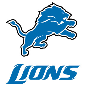
Detroit Lions New Logo
In an effort to distance themselves from last year’s 0-16 campaign, the Detroit Lions today officially unveiled their new logo–which is, in fact, not that different from their previous logo.
The new logo, which had been leaked on the Internet weeks ago, still features the Honolulu Blue Lion introduce in 1970 pouncing on…something–but now features more details, including a mouth, eye and details around the mane.
While the logo isn’t as drastic a change as say, the 1997 Tampa Bay Buccaneers change (when they dumped the classic creamsicle orange & winking pirate for today’s pewter, red & black skull & crossbones combo), I actually kind of like the new logo–and specifically like that they didn’t make too drastic of a change.
I also appreciate that the team, which just added the black outline to the Lion in 2003, didn’t feel the need to follow the recent trend in the NFL by changing to jerseys featuring different colored side panels & Nike swooshes on the pants.
Some traditionalists will likely decry the move, and the change is unlikely to cause their fans to forget about last season’s record setting performance–but with less than a week until the Lions are officially on the clock for the #1 overall pick, Lions fans can at least take comfort in the fact that the Lions could have screwed this up a lot worse.

This is what Robert Kraft said about the negative reaction to the Dynasty I loved the first three episodes I…
If I were to keep my want lists to the smallest most reasonable numbers (not everyone but the smaller highest…
never said there were no worthy contributors, just that the list is small and less than the number of deserving…
Paul I guess I can agree with that but there’s some worthy contributors in that pool like Robert Kraft Clint…
frankly (as I have expressed in past) my view on contributors-shared by many historians and voters is that the pool…